Revised December 22nd, 2014 [see also more recent images]
This is a collection of images that have been devised by following some geometrical rules, often with the intention of creating some optical effect. Many of the ideas have been influenced by studying the work of Bridget Riley.
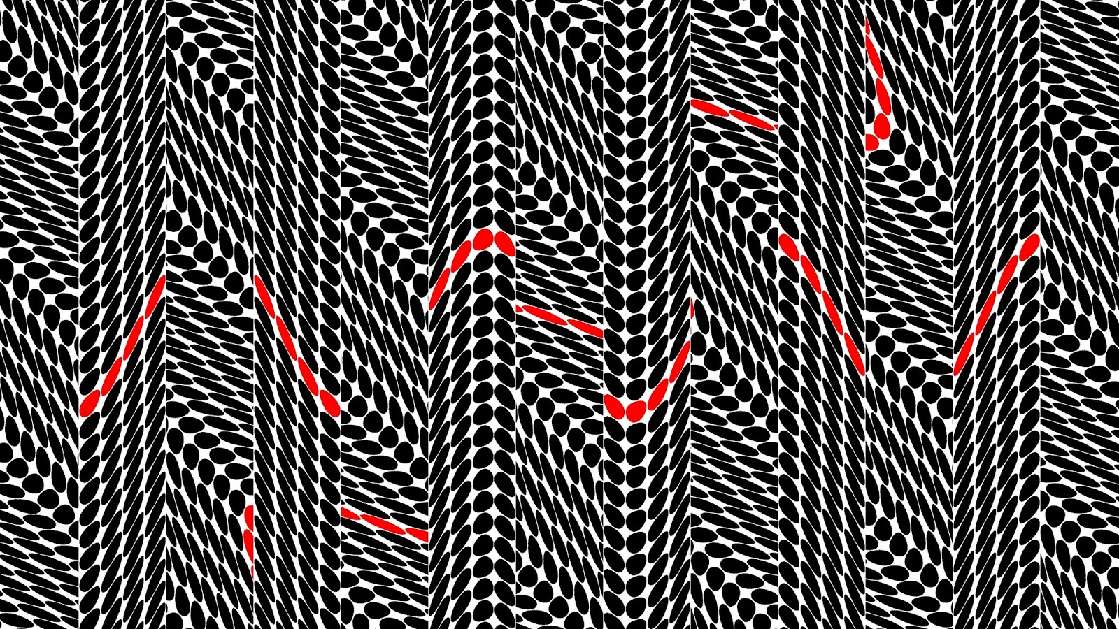
Although there are no apparent optical effects in this first geometric image, it is a good one to start with since it allows me to explain the geometry.
The field of dots (circles and ellipses) are arranged in a grid. The red snake is an axis of this grid. The grid is not a grid of squares, as would be usual, but a grid of sinusoidal curves set at 45 degrees to each other. The cells that are crated in this grid are then each filled with a dot whose shape and orientation is dictated by the edges of the cell.
This second image is based on similar images by Bridget Riley. It does have an optical effect. The optical effect appears in the "line" running across the centre of the page. It may or may not work effectively on your screen. You may need to zoom in or out to get maximum effect.
This third image is an experiment with colour. The proportion of each primary is determined by the position in the image. Here we have red cycling left to right, green cycling top to bottom and blue cyclng outwards from the centre.
We can replace the concentric circles with concentric hyperbolae.
I think I prefer the hyperbolae. The optical effect I hoped to achieve here does not work so well on the screen. It would be that the colours that you see are not the colours that I used, due to their adjacency. This images needs more work. Watch this space.
This image is a still from the video Optical Effects 4. There are two pencils of coincident "circles" in black and white. Where they cross is grey. As one pencil of "circles" rotates anticlockwise, some interesting optical effects happen near the centre of the image.
Here are some more images that have been produced in the same way as those described above, although some of them are much earlier


